With the intense pressure on ROI in higher education, telling a compelling story with your digital experience is more important than ever. But what does your audience need at each stage of their journey so they smoothly move forward to the next? And what are the most powerful ways to respond to those needs at every touchpoint so they continue down the conversion funnel?
To answer those questions, we first need to understand the emotional and rational gates prospects confront and the sequence of those gates. Only then you can effectively map your brand voice, information architecture, content strategy and user experience design to align with their needs.
After conducting 500+ individual interviews with prospective college students and parents over the last decade, we have assembled and codified our Higher Education Hierarchy of Needs process. Over the years of research, we have adjusted dials in each stage to react to the changing dynamics of higher education and the expectations of students and parents. For example, experiential learning has become a base “safety” need as skill-based learning and credential acquisition emerges as a powerful force in prospect’s decision making.
In this presentation, we will walk through the HEHON model, the insights that inform it and how to create one for your institution. For each stage we will describe key drivers and levers that move prospects from one stage to the next successfully. We’ll review considerations when creating a HEHON for undergraduate versus graduate and parents versus students.
We will review an example of how we applied this method to the top entrepreneurial college in America. In doing so, we will illustrate the following:
- How their HEHON led to a full navigation restructure which transformed their site from a department-based architecture to segment-based.
- How content was moved up in the funnel, amplified or deemphasized to respond to target needs in their journey.
- How page-level storytelling and UX devices helped move prospects “across” the site, as opposed to “pogoing” up and down the navigation.
We will outline the impact of these changes including:
- A 115% improvement in lead generation for undergraduate visitors with an increase of 53% in clicks to the common app.
- An 83% improvement in lead generation for graduate visitors with a 18% decrease in bounce rate.
- An overall conversion improvement across all their properties by 60%.
Refer to this case study for reference.
Presenter
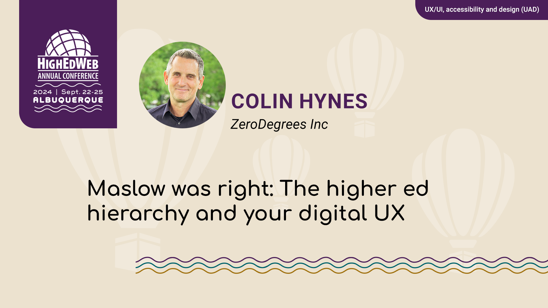
Colin Hynes — ZeroDegrees Inc
Log in
Please log in to access the recording, slides and other session materials. Paid members have full access to the entire library.
New members
HighEdWeb offers several membership classes. Join today as a premium, affiliate, student or institutional member for full access to this session. Become a paid member.
Shortcode
UAD1

